
I have been working on the cover design, though a publisher may choose to use a different one. I thought I would explain the elements that have been incorporated to convey the book’s story journey.
Visual Elements
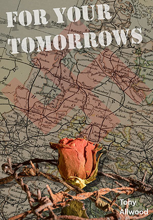
The cover features a historical map that serves as the backdrop, providing a sense of place and time. The map itself hints at a journey, both physical and emotional, that the book’s narrative promises to take its readers on. It suggests a story rooted in history and geography, adding depth and context even before the first page is turned.
Symbolism
A dried rose entwined with barbed wire evoke themes of sacrifice, memory, and resilience. The rose, a symbol of love, juxtaposed with the harshness of barbed wire, speaks to the enduring human spirit in the face of adversity.
Typography
The title, “For Your Tomorrows,” is presented in bold, white lettering across the upper part of the cover. The choice of font is both striking and military, ensuring that the title stands out against the intricate map background. This creates a visual balance that draws the reader’s eye, making the title the focal point.
Colour Palette
The colour palette is muted, with earthy tones dominating the design. The soft, sepia hues of the map and the dried rose’s faded reds and browns evoke a sense of nostalgia and timelessness. This choice of colours complements the historical aspect of the book.
The final design of the book cover for “For Your Tomorrows” is a harmonious blend of historical reference, symbolic imagery, and thoughtful typography. Each element has been carefully chosen to reflect the themes of the book, ensuring that the cover is not only visually appealing but also deeply meaningful. This evocative design promises to resonate with readers, inviting them to uncover the story within. Capturing the attention of potential readers and giving them a glimpse into the journey that awaits inside “For Your Tomorrows.”